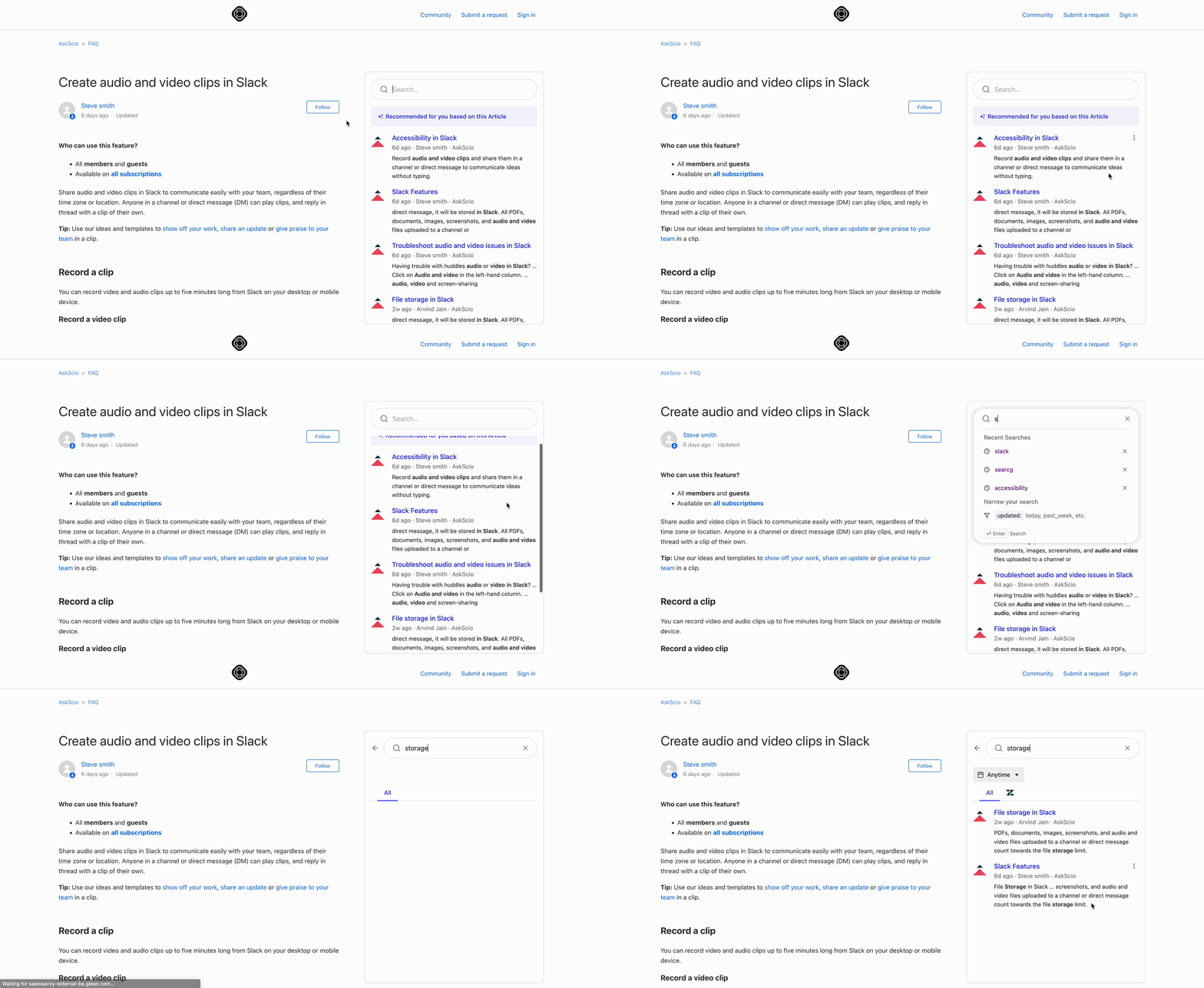
Recommendations
The recommendations component can be used to display contextual recommendations based on the current page.
It also includes a search box which allows the user to search manually.

Add Javascript API client
Include the JS library in the <head> of your page, where GLEAN_APP_DOMAIN is the domain at which your company
accesses the Glean web app. By default this is app.glean.com but if you've configured a custom sub-domain it will be
something like your-company.glean.com.
Note
The Glean web app domain is not the same as your company's Glean backend domain, which will be something like your-company-be.glean.com.
<script defer src="https://{GLEAN_APP_DOMAIN}/embedded-search-latest.min.js"></script>Setup
To render the component, renderRecommendations method can be invoked as required (e.g. on page load).
The method requires a container HTML element to render the component into. The container must be a block-level element with a non-static position, such as 'relative'.
Another parameter, options, can be passed in to customize the component.
The following is an example of setting up the component:
HTML
<script defer src="https://{YOUR_GLEAN_DOMAIN}/embedded-search-latest.min.js"></script>

<h2> Glean Recommendations Component </h2>
<div id="recommendations" ></div>
CSS
#recommendations {
  display: block;
  position: relative;
  width: 600px;
}
JS
addEventListener("DOMContentLoaded", () => {
  const recommendationsContainer = document.getElementById("recommendations");
  EmbeddedSearch.renderRecommendations(recommendationsContainer, {
    height: 700,
    customizations: {
      border: '1px solid grey',
      borderRadius: 4,
      boxShadow: '2px 2px grey',
      horizontalMargin: 3,
      verticalMargin: 3,
      searchBox: {
        placeholderText: 'Search for anything...',
        searchIconUrl: 'https://picsum.photos/18',
      },
    },
  });
});
Customizations
The full set of customizations can be found at RecommendationsOptions
Height
The default height is 650px, but this can be overridden by specifying the desired value using the height option.
Width
The width needs to be set on the container element passed to renderRecommendations.
We recommend limiting the max-width to 800px.
Others
Customizations such as border, border-radius, box-shadow can be set using RecommendationsBoxCustomizations.
Note:
- For box-shadow to be visible set appropriate verticalMargin and horizontalMargin.
- The margins are applied on both sides of the component and the values must be positive.
Authentication
By default, upon first usage, the user will have to both:
- Enter their email address and
- Perform SSO authentication
The first step can be avoided by passing the backend parameter.
The second step can be avoided by configuring a server-to-server handshake and passing the user's auth token to Options.authToken.
Note
When passing an authToken, a onAuthTokenRequired callback must also be configured to ensure that the token is refreshed when it is nearing expiration.
Note that if the user's browser disallows third party cookies then SSO authentication will not work and server-to-server authentication is required.